
Step By Step Studio Demo
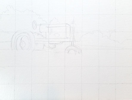
I don't normally use a grid, but this was slightly larger than my
normal sizes and I wanted to get it right from the start.
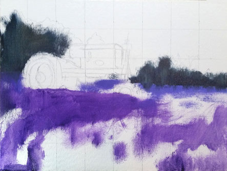
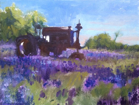
I wanted my bluebonnets to be as bright as I could make them so I used a
transparent purple ( not normally on my palette ) and blocked them in first.
Transparent paint over the white of the canvas always creates bright color.
Instead of painting individual flowers, I tried to create a pleasing pattern
that would help lead your eye into the painting and add perspective.
After blocking in my flowers, I establish my dark shadow shapes.
I am keeping my paint thin and brush strokes loose. Notice how
the perspective is working already with minimal effort. If you get
the basic drawing down and values, any color palette would work.
Because of my outdoor painting experience, I usually start my
paintings blocking in the dark shapes and shadow subjects first since
they are going to change the fastest. Also, getting the darks down will
allow them to set up enough that it will be easier to go back into.
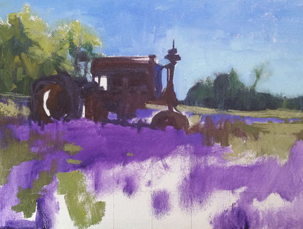
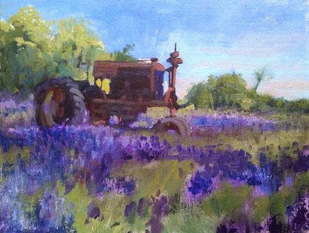
Sometimes I leave my sky until last but this time I went ahead and blocked
it in. I leave a little white of the canvas showing thru because I didn't want
to get my sky color into my tree colors. I also use a clean brush for my sky
and try very hard to reserve it for only that. I constantly wipe my brush with
a paper towel to keep the colors pure but using more brushes doesn't hurt.
I start adjusting my flower color and add more detail. I like textures that
suggest a group of flowers instead of painting in each one. I try to not cover up all
my transparent purple because it will be harder to get that glowing look back
after the white of the board is gone.
Even more detail. It doesn't take many smaller flower shapes to make the
clumps look like flowers. I squint my eyes down when I look at my subject photo
so it helps me to not see the detail and just see shapes. My stokes get smaller
to keep that feeling of distance.
Now I go back in with a few mid tone colors on my tractor. The subject is
backlighted, so it doesn't take much detail to establish the shapes. I normally
work a painting equally as I move around. It helps me decide how much
detail and work is left to do.
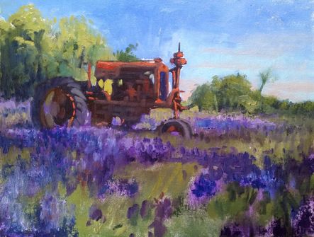
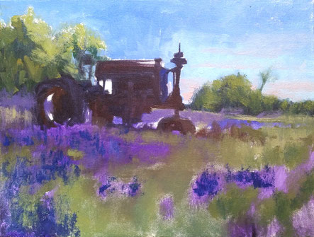
I couldn't hold off any longer and I went into my light red shapes
on my tractor. I like to wait as long as I can to add the light values.
They are what bring the painting to life.
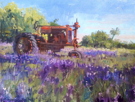
Adding more detail across the whole painting, working it all at the same time.
I have switched over from blocking in and I am now finessing edges and
building up paint in areas. I use thicker paint texture to help my perspective
or the emphasize areas I want the viewer to notice. For instance, the big tractor
wheel will have a thicker paint application than the back wheel and so
will items in my foreground.
I add pops of bright colors, but when I do, I try and add those colors
all around my painting so they look more natural and not out of place.
I also use a palette knife to lay in some finishing strokes.
The knife creates a more random paint application than my
brush and some textural effects I couldn't get from anything else.
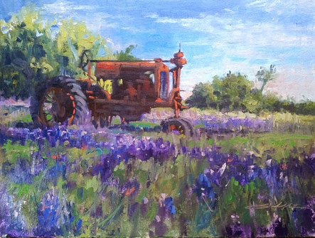
I scratch my signature into it and call this one done.
I recommend putting effort into what you name it too. I know I have sold paintings
because of the name. It is one more element to making a cohesive subject and add
narrative to your work.
"Something Old...Something Blue"
12 x 16